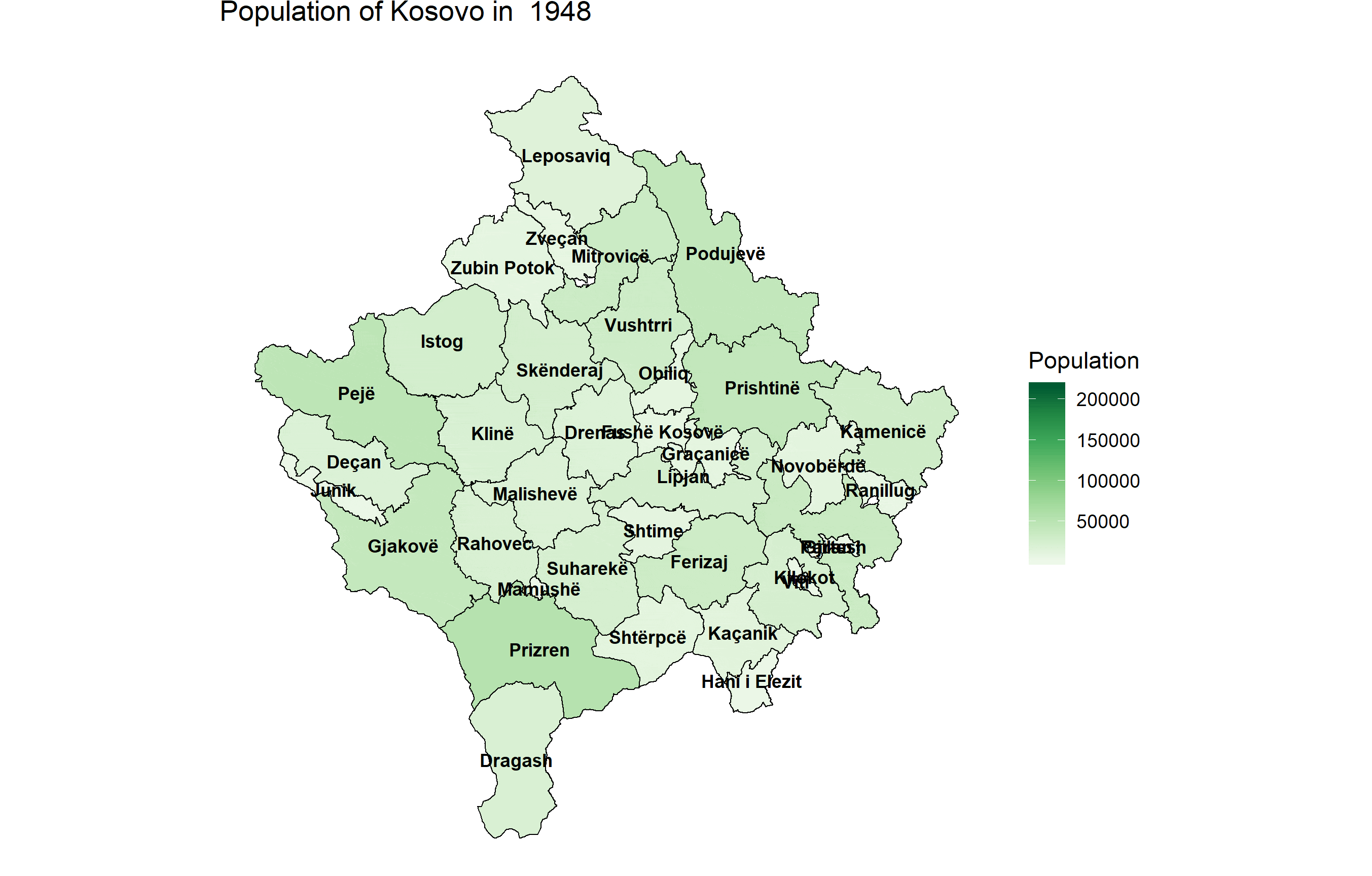
In this visualization you can see the population by municipality of the Republic of Kosovo from 1948 until 2018. The data isn’t annual, therefore I’ve had to interpolate the data between years, which might not show big spikes of population migration.
This is the first time I’ve created a GIF visualization, and it’s been harder than I’d like to admit. I’ve used Python to preprocess the data and create the .gif file, whereas R & ggplot was used to plot the data year by year. I had to reduce the size of resulting GIF with ezgif because the size was 30MB which was to big for a GIF like this.
The reason I wanted to use R for the visualization part was because of the really useful library gganimate. But, for some weird reason gganimate wasn’t working properly with the geom_polygon() function. Also the data on ASK was split by municipality and I had to merge everything by myself.
Tools used: Python, R Programming Languange (ggplot) & ezgif.com
Source: Kosovo Agency of Statistics